The Psychology of Color in Luxury Interior Design
When designing a luxury home, every choice contributes to the overall atmosphere, from the scale of architectural details to the textures of fine fabrics. Yet, one of the most powerful tools in interior design is often the most subtle: color. Colors don’t just decorate a room, they set the tone, influence emotions, and even shape the way people interact with a space.
At Fratantoni Interior Designers, our team has spent over three decades crafting luxury interiors that speak to the individuality and lifestyle of our clients. With projects spanning from Scottsdale, Arizona to New York, Florida, Texas, and Hawaii, we’ve seen firsthand how the thoughtful use of color can transform a residence into a personal sanctuary or a statement of grandeur.
In this blog, we’ll explore how color psychology plays a role in creating timeless, high end interiors and how affluent homeowners can use it to elevate their living spaces.
How Lighting Influences Color Psychology
In high end design, lighting is as important as color selection. A shade of ivory in natural light may appear stark under artificial lighting. Fratantoni Interior Designers carefully pair architectural lighting plans with color palettes to ensure that each room maintains its intended mood, day or night.
- Natural light amplifies lighter palettes and reveals texture.
- Warm lighting enhances reds, oranges, and golds, creating coziness.
- Cool lighting sharpens blues, greens, and grays, adding modernity.
Luxury homes often incorporate layers of lighting, recessed fixtures, chandeliers, sconces, and cove lighting, to highlight color’s full effect.
The Power of Color Psychology in Luxury Design
Color psychology is the study of how hues influence mood, perception, and behavior. In luxury interior design, understanding these effects is key to curating spaces that not only look beautiful but also feel intentional.
- Warm tones (reds, oranges, golds) often create intimacy, energy, or opulence.
- Cool tones (blues, greens, purples) can inspire calm, sophistication, and elegance.
- Neutral palettes (whites, creams, grays, taupes) convey timelessness, balance, and flexibility.
Unlike mass market interiors, luxury homes afford the opportunity to layer these effects with custom millwork, imported textiles, artisanal finishes, and architectural detailing.
Color in Different Spaces
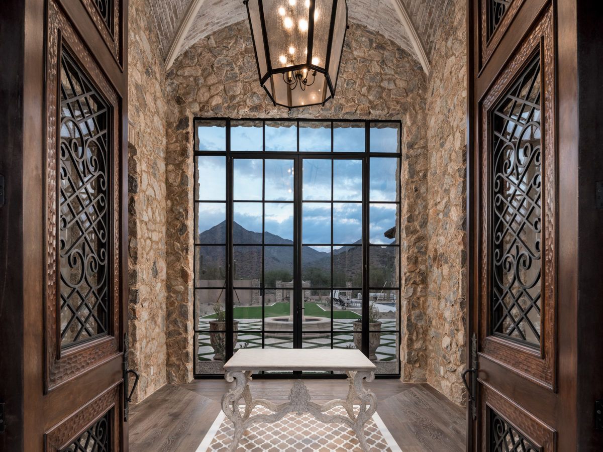
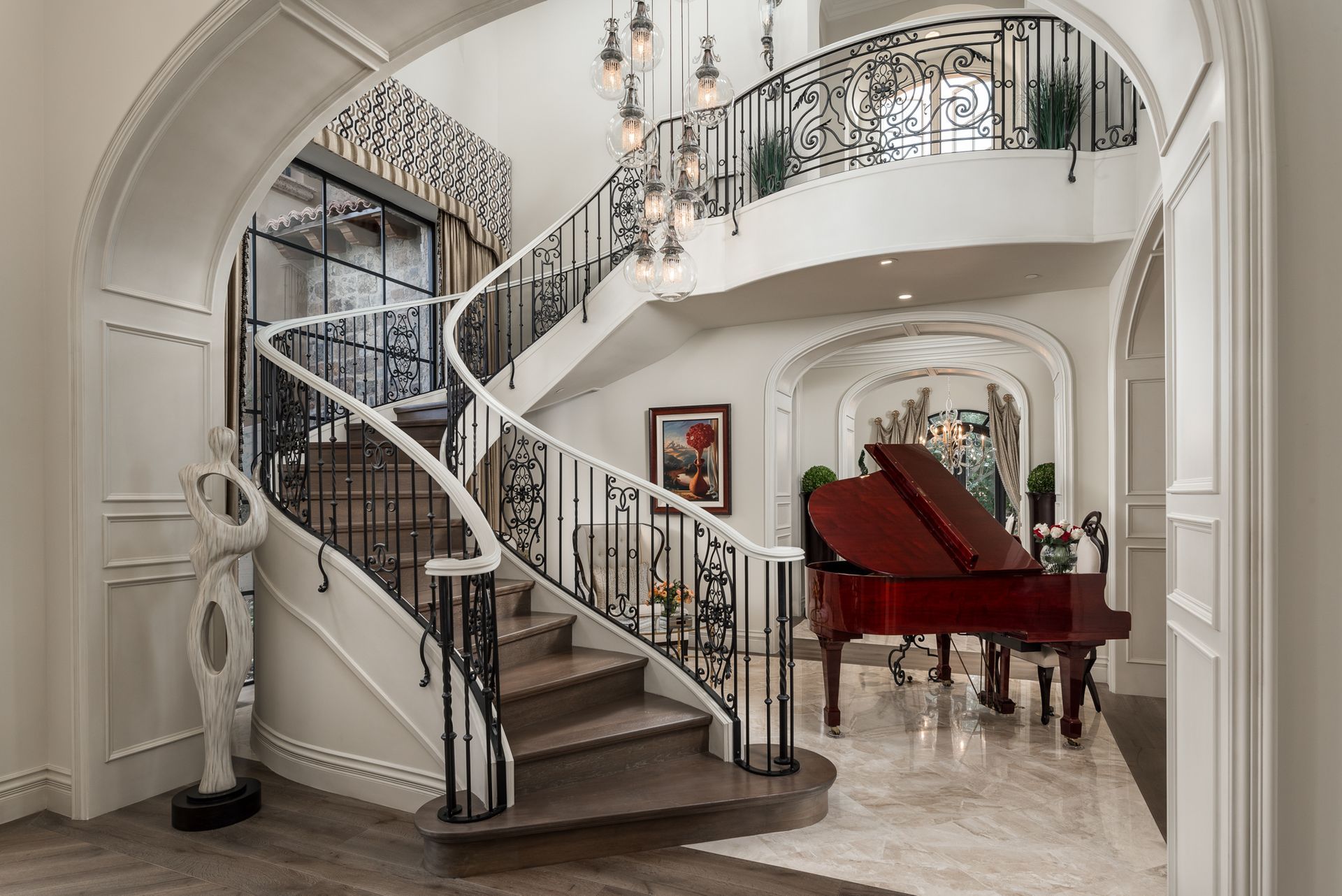
1. Grand Entrances and Foyers
The entrance is the first impression of a luxury home. Here, color should make a statement.
- Deep jewel tones like emerald or sapphire immediately convey richness and permanence.
- Light neutrals paired with metallic accents (gold or bronze) create a sense of refined elegance.
- A dramatic black-and-white palette enhances architectural symmetry, particularly in estates with sweeping staircases.
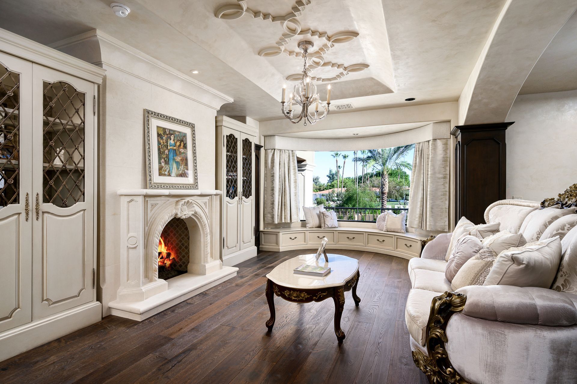
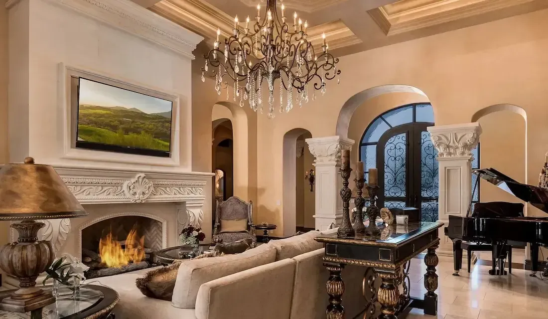
2. Formal Living Rooms
Living rooms in luxury estates often serve as showpieces for entertaining.
- Soft creams and layered neutrals allow bespoke furnishings and artwork to shine.
- Velvety navy or charcoal walls paired with custom lighting create intimacy and depth.
- Muted pastels (powder blue, blush, or sage) can bring warmth while maintaining sophistication.
3. Dining Rooms
Color psychology strongly impacts dining spaces.
- Rich reds and burgundies stimulate appetite and conversation, making them a classic choice for formal dining.
- Emerald green or sapphire blue provide a regal, timeless backdrop for entertaining.
- Taupe or ivory walls with gold leaf or wainscoting details convey refinement without overwhelming the space.
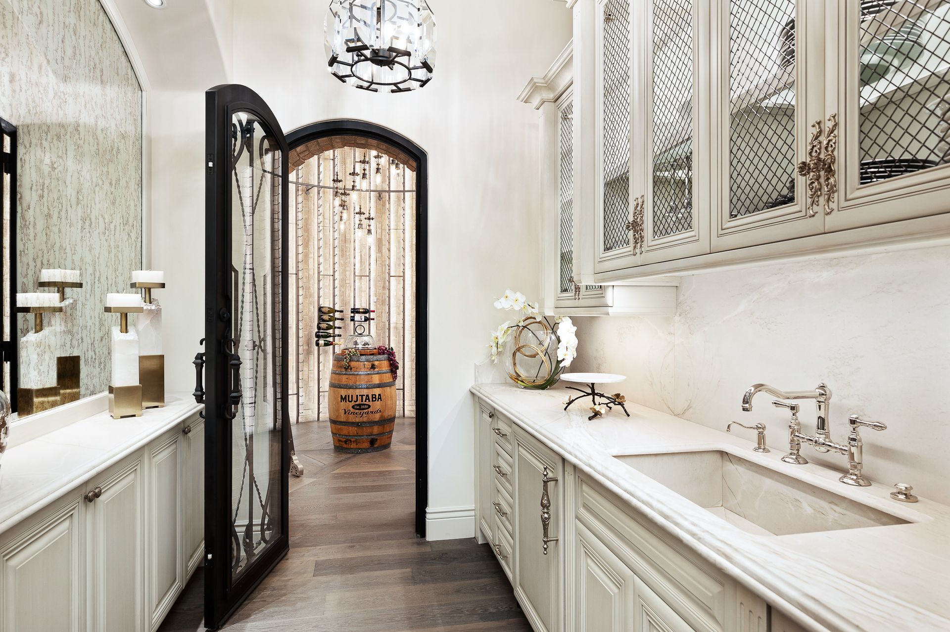
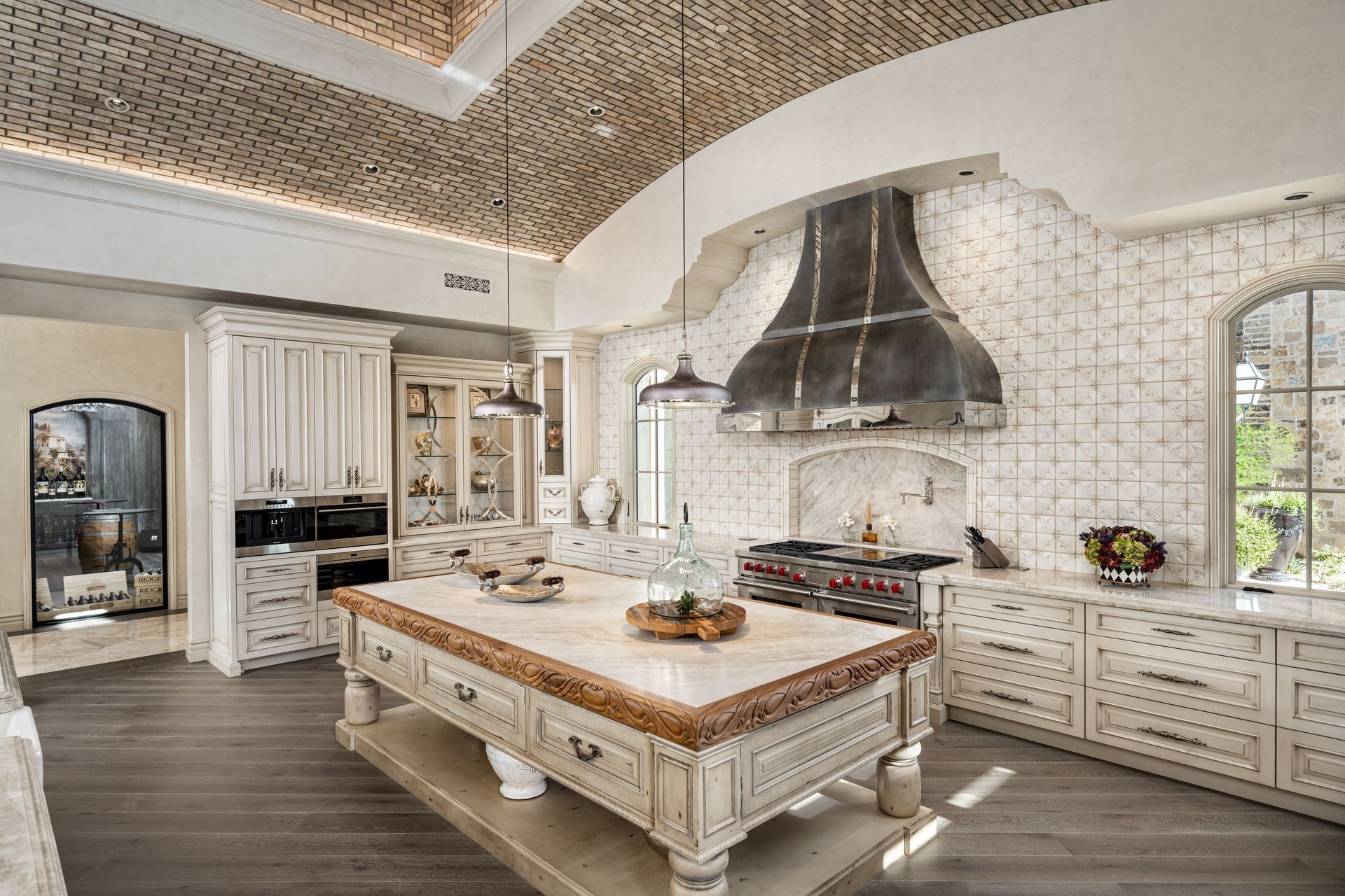
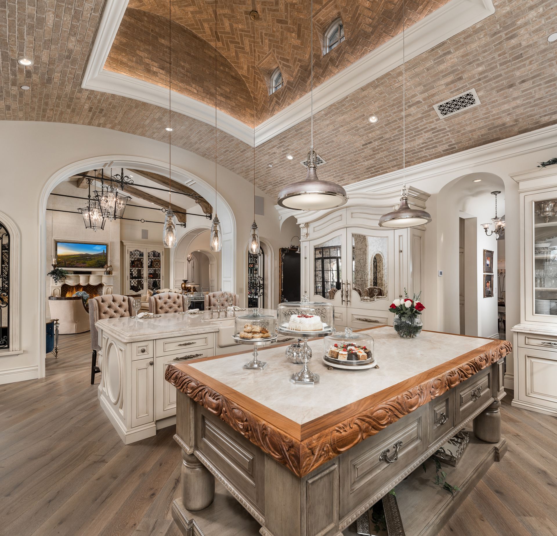
4. Kitchens
As the heart of the home, kitchens benefit from colors that balance energy and cleanliness.
- White and soft gray palettes evoke timelessness and pair beautifully with marble and natural stone.
- Deep blues or forest greens on custom cabinetry create contrast and luxury.
- Warm beige or cream tones complement natural light, especially in homes with expansive windows.
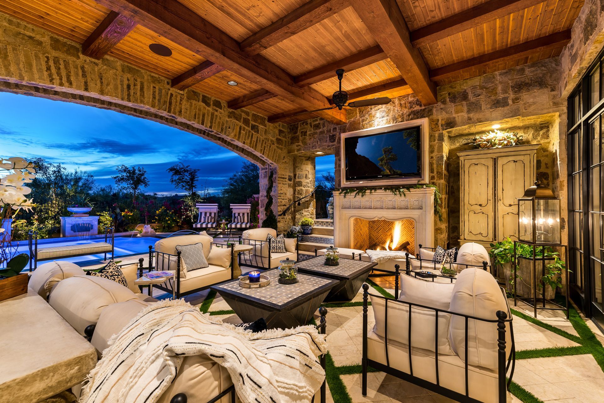
5. Bedrooms and Retreats
In private retreats, color should soothe and rejuvenate.
- Soft blues and grays encourage rest and tranquility.
- Lavender and dusty rose add romance and subtle luxury.
- Warm ivory or champagne hues offer a hotel-like serenity when paired with plush fabrics.
6. Home Offices and Libraries
Workspaces should balance focus with sophistication.
- Rich mahogany, navy, or hunter green create gravitas and concentration.
- Light gray or taupe fosters clarity and openness.
- Accent walls in charcoal or black add drama without distraction.
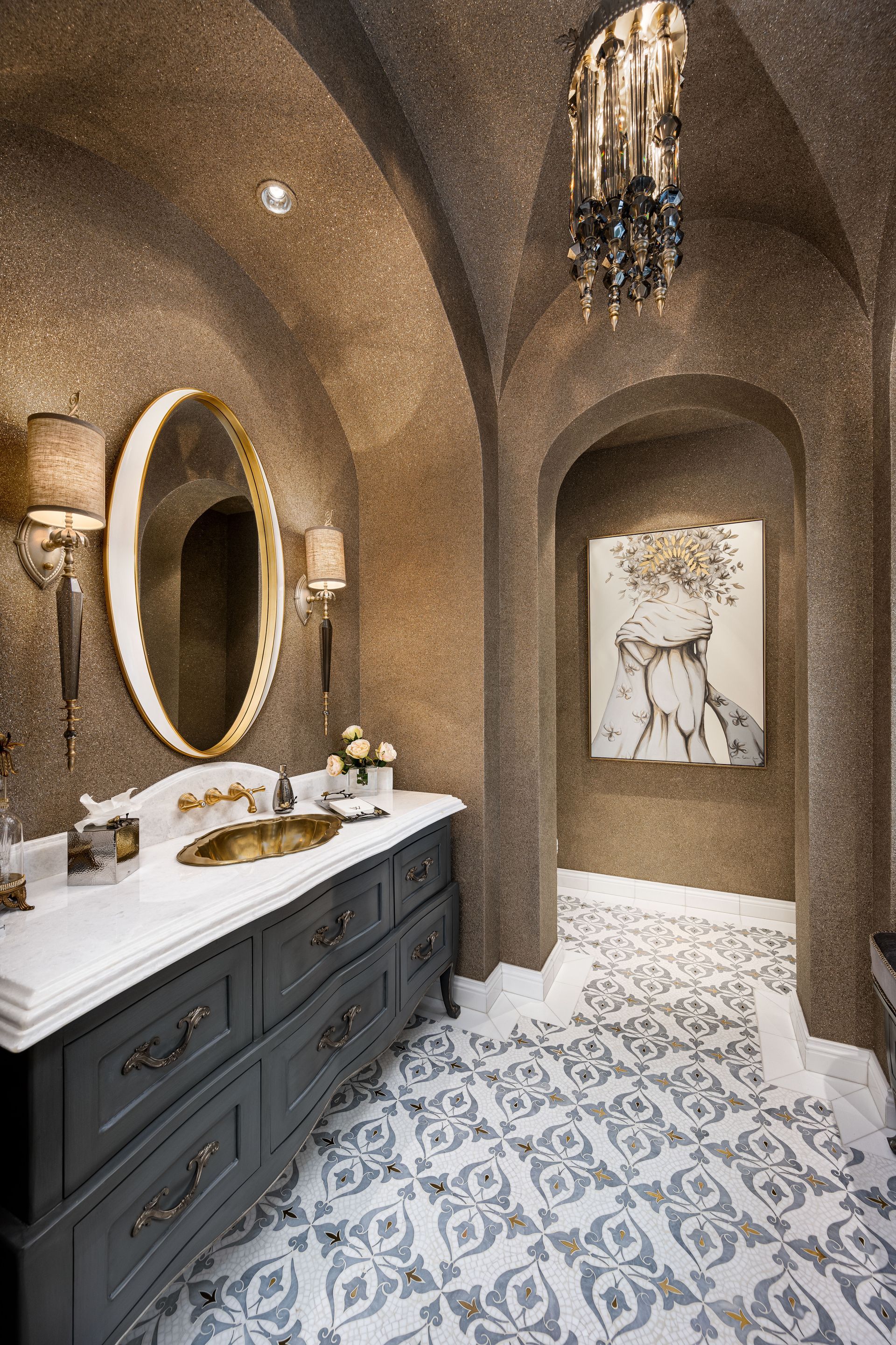
7. Spa-Inspired Bathrooms
Bathrooms in luxury estates often rival five-star spas.
- White marble palettes with subtle veining exude timelessness.
- Soft aquas and seafoam greens evoke relaxation and rejuvenation.
- Warm beige with gold accents creates an indulgent, hotel-like experience.
Balancing Bold Statements with Timeless Neutrals
A hallmark of Fratantoni’s luxury interiors is balance. While bold colors can make a space memorable, neutrals provide flexibility for evolving art collections, furnishings, and seasonal décor.
- Neutral bases allow clients to experiment with bold accent walls, upholstery, or accessories without overwhelming the design.
- Layered tones (ivory, sand, stone) prevent a neutral palette from feeling sterile.
- Textures such as silk, velvet, and metallic finishes add richness to monochromatic schemes.
Cultural & Global Influences in Luxury Color Palettes
Color psychology also draws from cultural associations. In our projects nationwide and internationally, we adapt palettes to client preferences and cultural traditions.
- In Mediterranean-inspired estates, terracotta, ochre, and azure mirror the landscapes of Italy and Greece.
- In modern desert estates, warm neutrals and sandy tones reflect Arizona’s natural beauty.
- In coastal retreats, crisp whites, sea blues, and driftwood grays evoke relaxation and timeless luxury.
By drawing on these global influences, we ensure each home feels rooted in place while remaining uniquely personal.
Expert Tips for Using Color in Luxury Design
- Start with Emotion – Ask what you want the room to feel like: calm, dramatic, regal, intimate.
- Layer, Don’t Overload – Use bold colors in textiles, art, or accent walls rather than flooding an entire space.
- Consider Flow – Colors should transition smoothly from room to room, especially in open floor plans.
- Test in Natural Light – Always view swatches in different lighting before finalizing.
- Invest in Custom Finishes – Luxury design allows for custom paints, wall coverings, and finishes that elevate a palette beyond the ordinary.
The Fratantoni Approach to Color & Luxury Design
At Fratantoni Interior Designers, color is never an afterthought, it’s a foundation. We blend architectural vision, custom furnishings, and interior detailing with carefully curated palettes to craft spaces that are as emotionally resonant as they are visually striking.
Whether designing a formal dining room in Kansas City, a modern coastal retreat in Florida, or a Mediterranean villa in Arizona, our process always begins with understanding the client’s lifestyle and aspirations. From there, we craft a bespoke design narrative where color plays a starring role.
Let Color Elevate Your Lifestyle
The psychology of color in luxury interior design is more than choosing shades, it’s about designing with intention. The right palette can inspire joy, encourage relaxation, foster connection, and elevate daily living.
At Fratantoni Interior Designers, we specialize in curating luxury interiors where color, texture, and architectural detail work in harmony to create timeless masterpieces. With over 40 years of experience and projects completed across the nation, we understand how to craft a home that feels distinctly yours.
Ready to bring the psychology of color into your home design?
Contact Fratantoni Interior Designers today and let us help you transform your vision into reality.
Contact Us