14 Interior Design Trends for Luxury Homes in 2026
How to Incorporate Them Without Sacrificing Timeless Elegance
Luxury interior design in 2026 is moving away from showy maximalism toward considered restraint. We asked 14 designers and industry experts what defines luxury this year and how homeowners can adopt these trends without sacrificing timeless elegance.
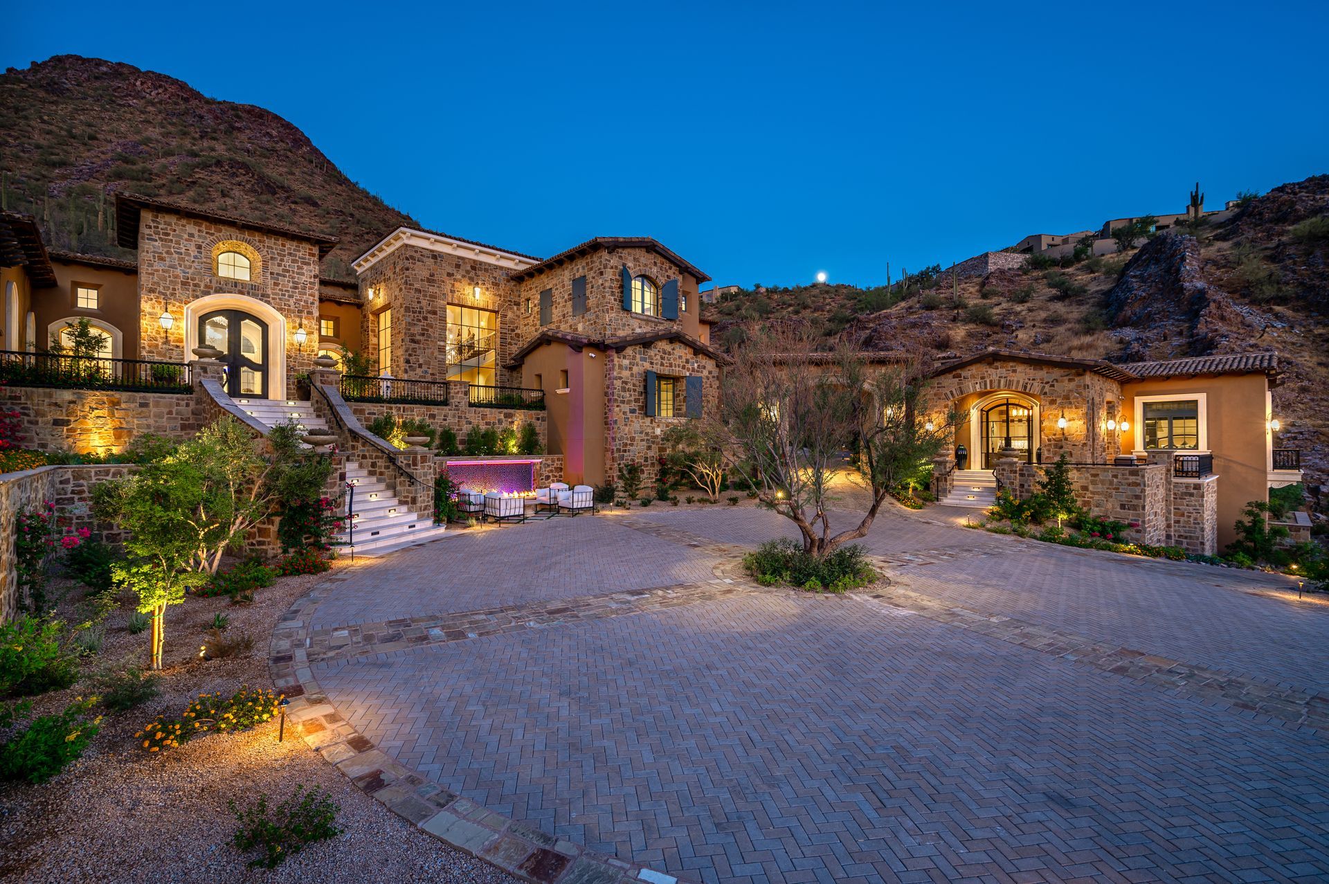
The most luxurious homes of 2026 won't try to impress you in the first ten seconds.
They'll still be impressing you in ten years.
That's the shift. Luxury used to announce itself; in gloss, in scale, in conspicuous newness. Now it earns its place quietly, through materials that age into their character, shapes that feel inevitable, and details chosen with the kind of care that only reveals itself over time.
So the real question for any homeowner planning a home remodel in 2026 isn't which trends to follow. Which choices will still feel right when the trends move on?
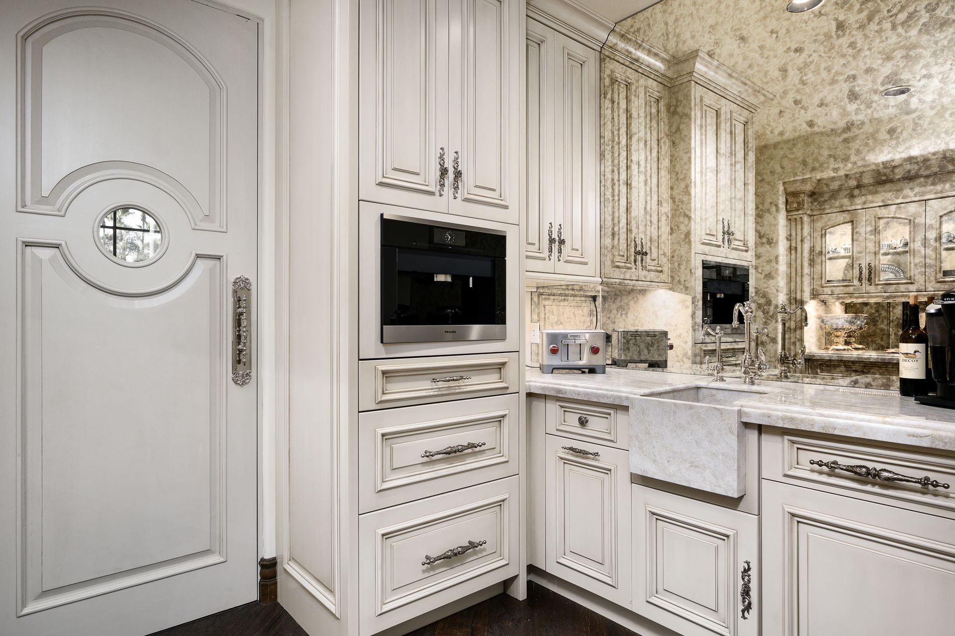
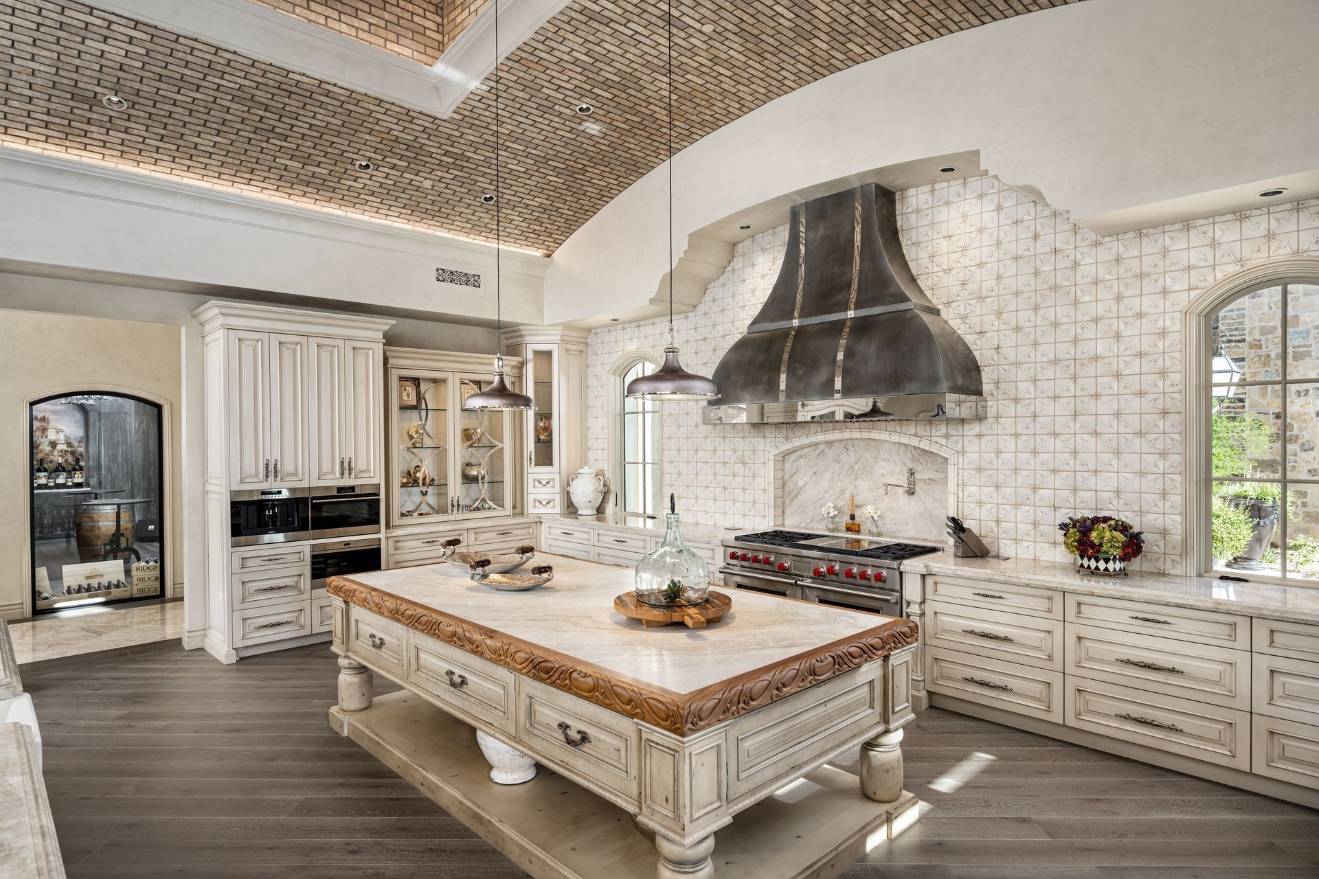
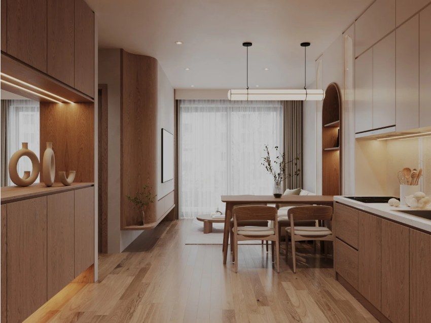
Materials That Age Beautifully
The single biggest shift we see in luxury interiors right now is a return to materials that improve with use rather than degrade from it.
1. Favor Earthy Textures and Calm Proportions
Natural materials create the foundation, but the way they're scaled and combined is what separates a sophisticated room from a busy one
"Materials such as wood, stone, and handmade textiles bring warmth and character to a space. Each element adds a distinct sensation, shaping interiors with greater depth and personality. To achieve this without compromising sophistication, balance is key. We combine materials like wood or natural stone with furniture defined by clean lines, ensuring each piece has the right scale and enough space to breathe."
Victoria Plasencia
Interior Designer, VP Interiorismo
In our practice, we often see homeowners drawn to natural materials but unsure how much is too much. The answer almost always comes back to proportion.
A single live-edge walnut dining table in a quiet, neutral room reads as luxurious. The same table in a room layered with reclaimed beams, raw linen, and limewashed walls starts to read as a theme. Restraint is what lets each material do its work.
2. Select Rift-Sawn Woods in Natural Tones
If natural materials are the headline, the cut and finish of the wood is the fine print most homeowners miss. And it's where dated kitchens are born.
"Stick with the wood's natural color… Pay attention to the grain pattern, too. Flat-sawn, wide cathedral grain can feel dated, as it's the cheapest way to saw a log. For added sophistication, ask your furniture maker to use rift-sawn or quarter-sawn wood. This method produces a much tighter grain pattern that's associated with sophistication, not a period in time."
Brian Benham
Owner, Benham Design Concepts LLC
This is one of the most useful technical points in the entire roundup. We often see clients invest heavily in custom millwork only to choose a stain color that pegs the room to a specific year. Going natural, and specifying rift-sawn or quarter-sawn wood, is a small detail with a timeless effect.
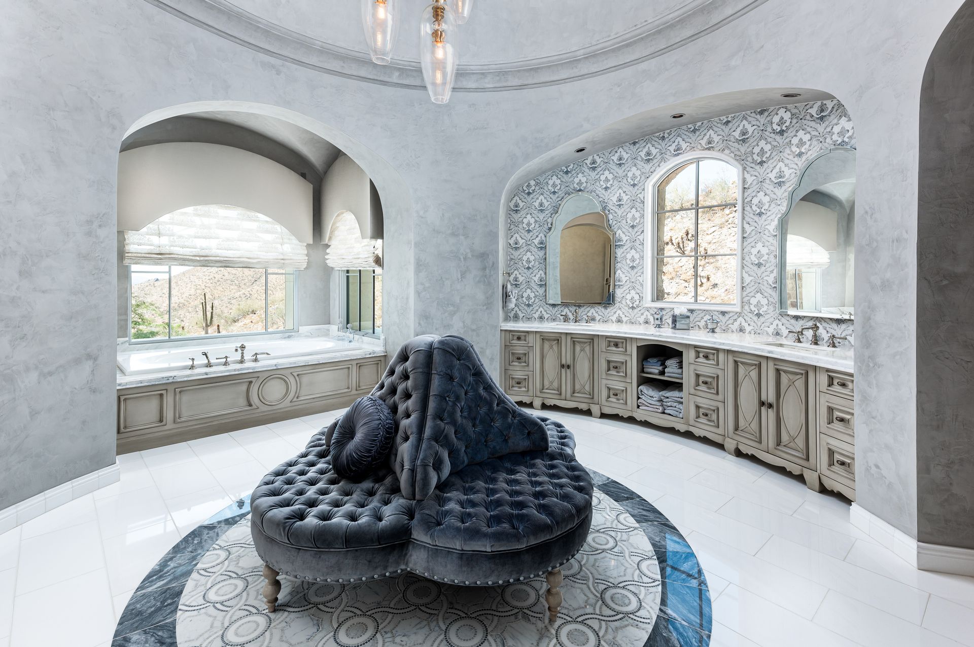
3. Let Patina-Rich Finishes Age Gracefully
The high-gloss look that dominated the late 2010s is giving way to finishes that are designed to evolve.
"What makes this trend 'timeless' isn't the materials themselves — it's that they're designed to patina. Unlacquered brass develops a living finish over years. Honed marble hides watermarks and softens with use. Limewash deepens as it breathes. Patina materials age gracefully; shiny materials age poorly."
Marcos De Andrade
Founder & Owner, Green Planet Cleaning Services
Patina is the difference between a finish that fights wear and one that absorbs it into its character. The conversation always starts with managing expectations: a brass faucet that develops a warm, mottled finish over five years is doing exactly what it's supposed to do.
The Edited Home: Curated Restraint
Beautiful materials only do their work in rooms that let them breathe. The next set of trends is less about what you put in and more about what you choose to leave out.
4. Pursue Minimalism Enriched by Material Contrast
The most common mistake in high-end residential design right now isn't excess. It's the opposite; over-edited rooms that read as flat instead of refined.
"One of the errors I observe in recent residential projects is over-editing. Clients eliminate clutter, but eliminate character… The remedy is to place emphasis on materials, rather than ornamentation. Begin with a reserved color palette… but mix it by contrast using materials… Pair smooth surfaces such as polished stone with tactile elements such as linen, natural wood, or subtle textured walls.”
Syed's distinction is the one we return to most often with clients: minimalism is not the absence of richness. It's the careful curation of it.
5. Choose Bespoke Craft as Focal Points
In an edited room, the few pieces you do choose carry the whole room's weight. They need to deserve it.
This is paragraph text. Click it or hit the Manage Text button to change the font, color, size, format, and more. To set up site-wide paragraph and title styles, go to Site Theme.